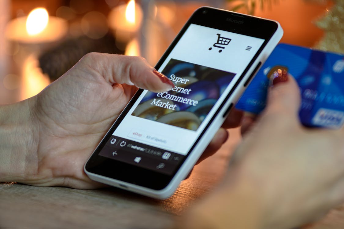
Your website's checkout process has to be mobile-optimized if you want to run a profitable e-commerce business in 2022 and beyond.
Why, I hear you wonder, is the checkout process?
the reason being that's where the money is.
These figures show that mobile optimization is something you cannot afford to ignore.
Therefore, I have the following question for you if you're an e-commerce manager, marketer, or CRO specialist looking to increase mobile conversions on an e-commerce website:
How can you improve the conversion rate of your mobile checkout flow?
I assume you already have some plans about how to approach the situation. We'll go over 12 more best practises in this article that will help you have a better mobile checkout experience.
Disclaimer: Not every recommended practise described in this post will increase the conversion rate of your mobile checkout flow. We advise you to experiment to determine what functions best on your website.
Now that that has been stated, let's get started.
Why Should Your Mobile Checkout Be Optimized?
It is widely known that the majority of e-commerce websites receive more traffic from mobile devices than from tablets or desktops. Techjury projects that in 2021:
Desktops provided 42.9% of the traffic, while mobile phones contributed 54.25 %. What is less well known, however, is that mobile conversion rates are lower than those for desktop visitors.
Statista states that:
As of the third quarter, mobile internet shoppers had a conversion rate of 2.2%. Tablet users made up 3.3% of the total. 3.7% of users were using a desktop. This demonstrates that despite more mobile usage in 2021, there were fewer conversions.
This is why using mobile checkout techniques is so important. Despite the high volume of traffic you receive year after year, if your e-commerce checkout page is not optimized, your cart abandonment rate will only increase.
Make The Checkout Button Stand Out.
The last thing you want as an e-commerce website is for customers to arrive at your checkout page and leave their basket empty because they can't seem to find your checkout button.
Many of us may relate to this suffering. When customers must scroll to find the checkout button to complete their order, it is a major turnoff for them. A checkout button that blends with the background is below the fold/not sticky, which forces customers to look for it.
This causes significant friction for online shoppers and raises the rate of cart abandonment.
It is simple to fix this:
Your checkout button has to be sticky or above the fold. Customers will notice the button when they arrive at your checkout page with the intention of finishing their purchase if it is above the fold. Making the checkout button sticky will allow you to go one step further and ensure that it always scrolls with the user.
The checkout button's colour should stand out against the background of the website. This makes it noticeable and distinctive.
Here is an illustration from the Judy brand.
Give guests the option to check out. Many customers are reluctant to divulge their information, especially if it's their first time making a transaction from you.
You're losing a lot of money if your e-commerce website needs users to fill out a long form or register.
But this is a problem with a simple solution—the low-hanging fruit. Offer a guest checkout option where customers can place their email and shipping information to receive their order.
This benefits customers who are cautious about sharing their personal information online and lowers cart abandonment on your checkout page.
If a customer is not interested in creating an account, they will see the guest option on Glossier's checkout page as the first thing they see.
Permit users to log in using Google or other social media sites.
The majority of the difficulty with mobile checkout comes from entering information online. The more fields your checkout form contains, the more steps and complex procedures it contains, and the more friction it creates, resulting in an increase in cart abandonment for your e-commerce website.
Allowing hesitant shoppers to log in via Google or other social media channels is a different approach to take with them to prevent the abandoned cart rate on your site from increasing. These are the issues it addresses.
Comments